Small details revealing the master's hand
Let us proceed, and have a look at some small details revealing
the master’s hand:
1)
Look at
the back of the chair. Try to see how the colour is heightened with
red and white lake in the same brushstroke. We find the same in the
water mirroring in front of ‘The
studio boat’,
ca 1874, Kröller-Muller Foundation, Otterlo. In fact, the whole
water surface here is familiar to us, thinking of our ‘River Scene’,
and the zig-zag reflection in
the infra-red photo.
Interesting is also to notice how this canvas has been reworked.
From the roof of the Studio boat, beneath the final layers, there
are strong, yellow strokes, seen going upwards, and then turning off
to the right.
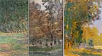
This
painting is also really worth a closer comparison with our Meadow
scene: Compare the long row of black trunks at the shore in the
Studio boat, with the M-s and the trunks in the background to the
left, painted in warm yellow, where the sun shines on them, and in
lilac/blue, where the trunks are in the shadow! Again, we observe
another recurrent detail, please look at: ‘Meadow
with haystacks near Giverny’,
1885, Museum of Fine Arts, Boston, (W 995). There they are again,
painted in lilac/blue, the same short trunks!
|
Click
HERE for detail comparison of trees. |
In the painting
‘Jean
Monet on his Horse-Tricycle’, (W 238), the wheels are
heightened in the same way as in the back of the chair. Remember
also the dominant geometrical shape here – the circle, and the
‘looking-through-effect’.
|

Click
HERE to see a comparison with our Garden scene. |
2)
The oval shape of the table.
The oval plays a very important part in the efforts of Monet, trying
to construct different scenes in his paintings. Compare the
water-lily-paintings, and the outline drawing of the oval leaves. A
few quick strokes, often parallel, exactly like the oval of the
table. The oval shape makes the experience of our mind apprehend the
feeling of the depth dimension. Compare the ‘Nymphéas
roses’, Galleria Nazionale d’Arte Moderna, Rome, (W 1507).
Listen to Virginia Spate:
” in the Nympheas of c 1896-7, depth is suggested by the stems of
the lily buds and the darkening contours below the leaves, and
recession (depth into the scene) is signalled by the foreshortening
of the leaves; however, lacks the structuring tension introduced by
the reflections. (The colour of time p 262).
Déja vue? Yes we do have seen a similiar table before. Here it
is, cut by the right edge in the same way and playing the same part
in the composition.
|
Click
HERE for a comparison. |
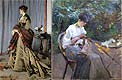
3)
Compare also the outline
drawing of the legs of the table, (with a few, superior
brushstrokes) with the umbrella in the painting: ‘Femme
assise sur un Banc’, (W.343), 73,5x56, 1874, The Tate
Gallery, London.
Please also note how the
dress was cut by the edge of the canvas, and that it was
created in an unpainted reserve. The main colour
of the dress is the original colour of the canvas! And again we
recognise the long, vigorous brush strokes of the dress!
Here we also find a most
interesting technical detail. See how the parasol is
painted – Monet starts with the ’body’ of the parasol the
white/blue/grey mixture and then gives it the final shape with o few
quick strokes, wet in wet, and the ’black´ mixture drags into the
underlying colours. Please now have a close look at the table. The
cloth is painted first ’hanging in the air’ and secondly he
creates, with a few quick strokes, the table using a ´black´
mixture - wet in wet – and we can see exactly the same effect when
the ’black’ drags into the white/grey colour of the cloth.
Concerning the black colour,
we know that Monet excluded this from his palette since black does
not exist in nature. Anthea Callen in her ’the Art of Impressionism’
writes: ”Blacks made from subtractive mixture of bright, contrasting
colours were widely used
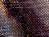 by
the Impressionists, especially in the 1870s. The pigments most often
employed were alizarin red, viridian green and French ultramarine –
very saturated hues with high tinting strength. Furthermore, their
transparency, even when combined, gives the resulting black a purity
and jewel like brilliance that would be lost if opaque colours were
introduced." (p.149). This is exactly what
we find here: a mixture of red dark lack, blue and green,
shining like jewels. Click on the picture to see a closeup. by
the Impressionists, especially in the 1870s. The pigments most often
employed were alizarin red, viridian green and French ultramarine –
very saturated hues with high tinting strength. Furthermore, their
transparency, even when combined, gives the resulting black a purity
and jewel like brilliance that would be lost if opaque colours were
introduced." (p.149). This is exactly what
we find here: a mixture of red dark lack, blue and green,
shining like jewels. Click on the picture to see a closeup.
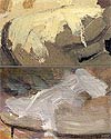
4)
Next another
detail: take a close look and observe the way the cloth on the table
was painted. A few, quick strokes - and there is what our eyes
register as a cloth. Now please have a look at ‘Camille
assise sur la Plage ŕ Trouville’, 45x36, (W 159).
Study the brush
strokes on her right arm sleeve. Here
nearly exactly the same quick brush strokes appear – but now we have
the ‘Impression’ of seeing reflections of the shining sun! Please
also notice the shadow of the arm. See the same in the
'Meadow Scene'!
Is there
something else in this painting that we recognise from our ‘River
Scene’?
Yes! The boat
of the first state is now partly painted
over with exactly the same colour, and in the same slovenly manner,
as the black chair that you easily can see having been painted over
to the right of Camille. Obviously the chair was one fence
too much for our eyes.
|
Click
HERE for comparison of overpainted areas. |
|
Click
HERE for a comparison of the painting technique. |
Perhaps you have already seen that there is
another part beside this in our River Scene, that is painted over in
the same way, but now in light blue? It certainly seems a little
odd, don´t you think? We simply have to remember that this painting
is a sketch. But it is not hard to find other paintings with similar
roughly overpainted places. In the two pochades from ’La
Grenoulličre’ the sky is changed and painted over in both of
them. In the painting ’Garden house on the bank of the Zaan’ from
1871 we can see an overpainted part in the sky aswell.
5)
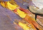
The splashes of
the sun on the gravel walk must also be mentioned, being so
important for the feeling and the whole
atmosphere. But they are more than this. They are concrete evidence
for Monet’s everlasting struggle – trying to catch the light in his
paintings. A key to perceive and understand the way Monet solves
this problem, is to study the dualism of light and shadow.
Click for larger picture
In our painting, Suzanne is sitting in an open
place, probably surrounded by bushes. A filtered light is coming
from above, and we can see it reflected up at her face, from the
white cloth she is working with! (Remember that the brown colour of
the canvas of today is caused by old varnish that not yet has
been possible to remove. We can only dream of
what it once looked like, with the original light colour of the
canvas!).
We also get a nice feeling of a warm summer
afternoon. This is an effect indirect given by
the warm yellow/red splashes on the ground - indicating that the sun
is shining from behind us. These splashes are enough to make us
feel, that this is one of those warm summer afternoons to be
remembered.
» Next:
The Meadow Scene
|